
The Problem:
* Information overload
* Hard to navigate and locate where everything is
* Too many items in the main navigation
* The labeling system makes it hard to differentiate
The Opportunity:
* Reimagine the information architecture
* Reorganize categories to make it easy for users to find information
* Renaming some of the labels to clarify their meanings

We decided to explore the parks in Lower East Side and observe how residents utilize Parks and Recreation services and facilities, we hoped to uncover problems residents encounter in the neighborhood; and understand experiences with and expectations for the community board.
We visited Sarah D. Rosevelt Park and conducted preliminary interviews of the local residents, we learned that:
1. District No.3 is a demographically diverse neighborhood;
2. Many residents do not have the proficiency to communicate in English;
3. The residents care about their community and want to contribute to the growth and development of their neighborhood.
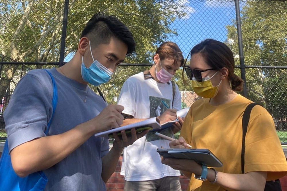
We think it is important to understand the needs of our stakeholders and the user that we design for, hence we conducted in-depth interviews with both the community board members and the local residents.
Our Insights
* Although the community board hosts meetings regularly, it is still difficult to get everyone’s voice heard;
* Due to language barriers and lack of resources, it is difficult to get problems solved in this community.
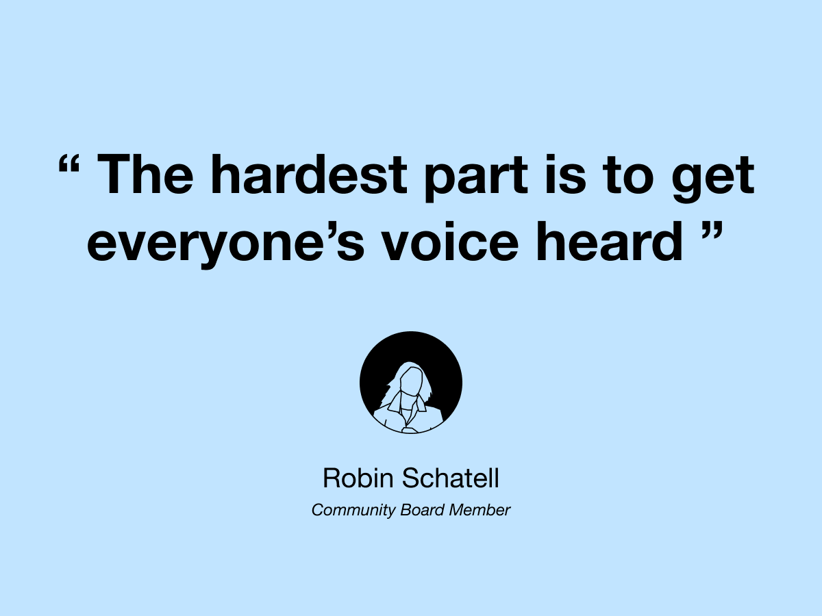
With the insights gathered from our research, we uncovered an important issue which is the inefficient communication between the community board and the local residents. The team decided to solve this problem as it would help residents get more engaged in the local community.
Direction: Provide a platform for residents to voice concerns and report issues
JTBD: When I encounter a problem in my neighborhood, I want it fixed quickly, so I can improve the quality of life for myself and my neighbors.
Card sorting helped us understand how users would organize and find information naturally, we came up with 42 cards based on our research and user needs.
What We Learned
* Our cards had become abstracted by research themes that were not necessarily web pages or categories for the website;
* Responses varied significantly, but some patterns emerged that could help us approach our objectives.
Based on the card sorting responses, we created our new categories

.jpg)
Tree test helped us examine if users can find information based on the new categories we proposed. The results varied, some tasks were completed with 90% success, some almost failed 90%.
What We Learned
* ‘Contact’ should be added to the navigation bar;
* The Community Board category was too general and acted as a magnet;
* Rename ‘Calendar Agenda’ to ‘Meeting Agenda’.

Based on the insights from card sorting & tree testing, we restructured the categories and included information on the current site and proposed this new site map.
.png)
Based on the JTBD and proposed site map, we created this user journey map to empathize with users. Due to the scope of the project, we focused mainly on seek help and report issues.

Based on relevance to the issue we are trying to solve, we selected nine websites for competitive analysis.
Insights
* There should be information about how to document concerns and build a case to help residents get their problems solved;
* Categorizing problems helps users define the problems they experience;
* Users should be able to include attachments when submitting reports;
*The site should provide updates to users with the status of their reports.

Based on the above findings & insights, we summarized the following 4 design principles for issue report service:
.png)
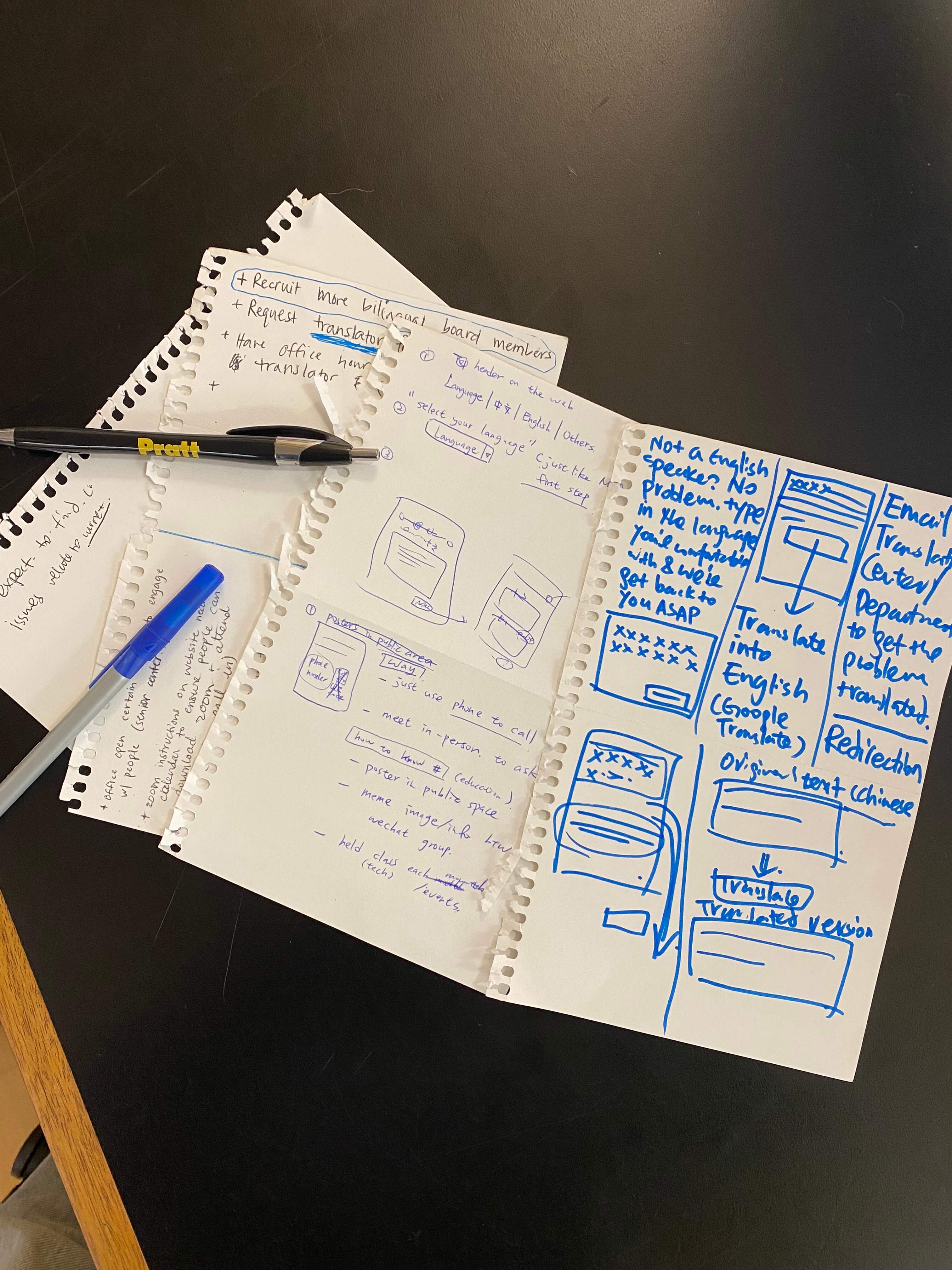
With design principles defined, we conducted a feature workshop to ideate on solutions to help address the language and tech accessibility on our redesign.
Language Barriers
* Have translation feature to translate the entire page;
* Allow users to type in their preferred language and translate it to English.
Low Tech Accessibilities
* Zoom instructions to help residents use zoom to attend meetings;
* Instructional Youtube videos to help residents efficiently use the site.
Reporting a Concern
* Comment box for residents to voice concerns;
* Issue report form for residents to file complaints.
We used our JTBD as the foundamental framework to inform our wireframe and prototype creations. We did not opt for personas or mindsets, as we think JTBD is the most straightforward approach to this problem and will introduce the least amount of bias.
We created a low-fi prototype and conducted user tests to help us understand what users need when they report issues on the site.
What We Learned
* Users do not know what CB3 is, therefore context should be provided;
* There should be a disclaimer for users to contact 911 for urgent issues;
* There should be a category for users to report miscellaneous problems.

Based on our findings from the low-fi prototype, I iterated and created this report concerns flow. I also incorporated the language accessibility and the attachment feature to further ensure our website can reach out to more residents and help them report concerns efficiently.
.png)
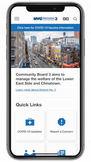
We used the style guide from ny.gov to design our high-fidelity prototype. As for the layout, I wanted to keep it minimal so that users won’t get overwhelmed by the visuals. Additionally, the CTA and navigation are clear and sound, this will further ensure a smooth user experience.
.png)
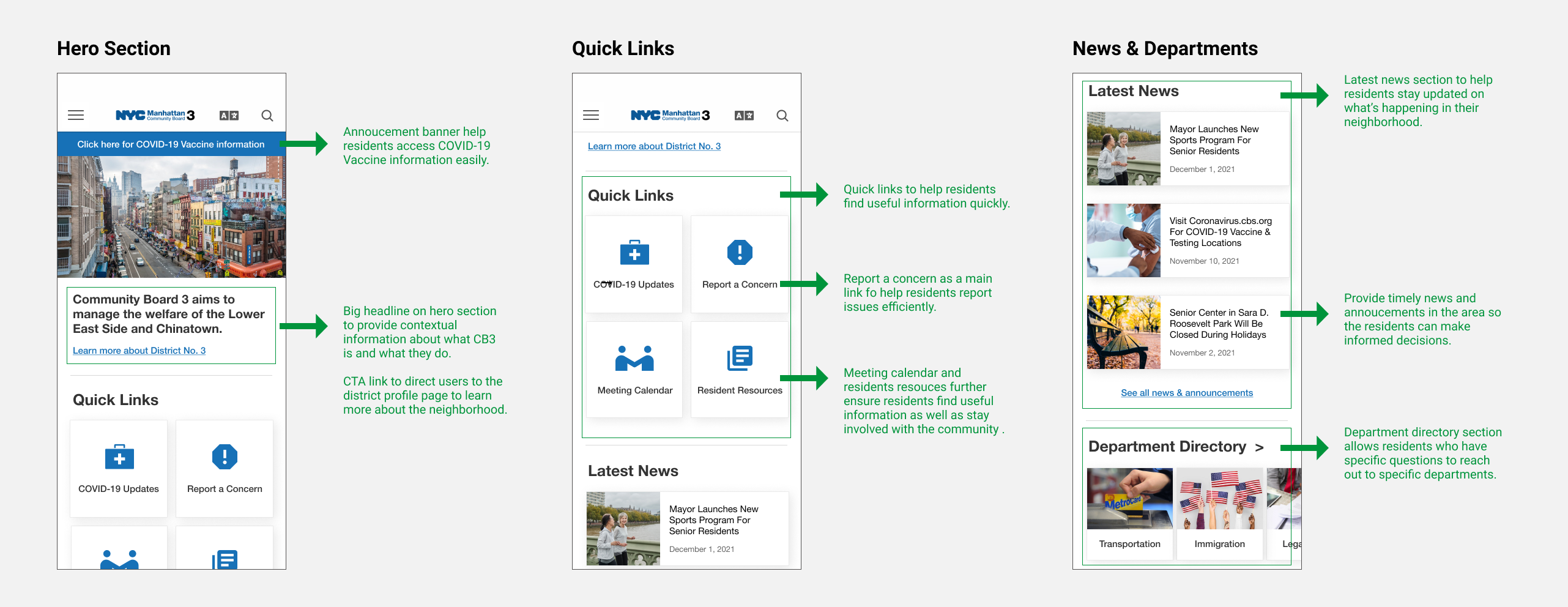
Here are the high-fidelity home page redesign I created based on our wireframes and ny.gov style guide. I made both desktop, mobile and iPad versions to better display the layout and responsiveness.

This is the most in-depth and collaborative UX project I’ve worked on, the topic is not something that I am particularly familiar with, therefore user research definitely helped tremendously. It allowed me to empathize with the actual user as well as understand our stakeholders. I learned a lot from the process, and realized conducting user research and analyzing the results is not a one-step process, but with a supportive team to work together can make things a lot easier. Furthermore, the extensive user tests and workshops solidified the user-centric approach to this project, and I will be sure to adopt this ideology to my future studies and always keep users in mind when create products.