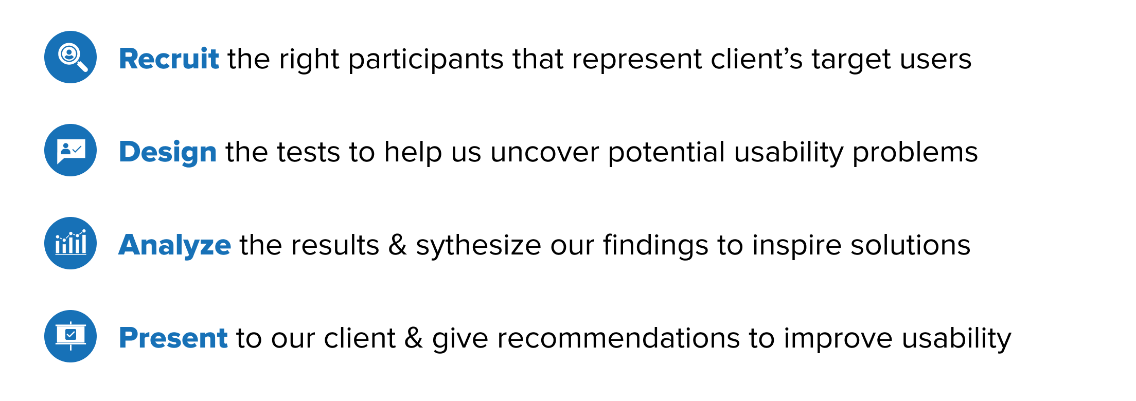
Our team of UX Designers & Researchers from the Pratt Center for Digital Experiences met with Stephanie Foxley, the Digital Lead at Strykk to define our goals and scope for this project.
Goals: Provide usability insight and recommendations to optimize the website and ultimately increase conversion.
Scope: Conduct 6 moderated remote user tests on 4 tasks related to STRYKK’s desktop website.
Target User: Millennials who are interested in trying or currently use non-alcoholic beverages.

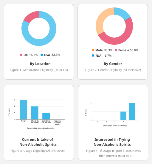
According to the Digital Lead, STRYKK hopes to lower their current age demographic from 35+ down to a range of 25-35 to match their target user. Given this objective, participants who closely matched STRYKK’s desired criteria were carefully screened and selected based on the following:
* Currently located in the US or UK
* Orders beverages or groceries online at least 2-3x per year
* In the age bracket of 25-35 years old
* Interested in trying non-alcoholic spirits or currently consumes them
After defining our target user, we sent out a Google Form pre-screening questionnaire through Pratt Institute’s email channel and social media platforms. We received 25 respondents. Out of the 25, 6 were selected based on closely matching the STRYKK’s target user profile. Noting that selected participants would receive a $10 Amazon gift card as compensation for their time. After recruitment was completed, I scheduled 2 sessions via Zoom.
To ensure all 6 sessions are consistent between the 3 moderators, we prepared the following materials:
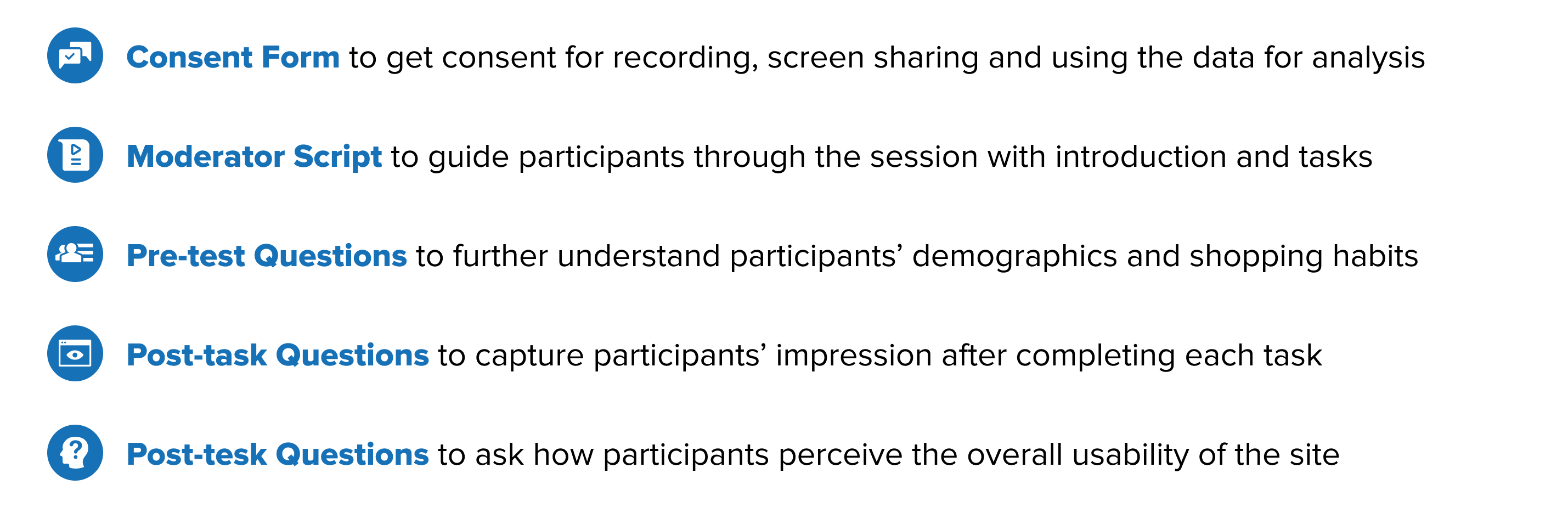
Scenario
You are planning a dinner party for next weekend and you want to accommodate several friends who are designated drivers. You decide to purchase non-alcoholic spirits as a substitute after seeing the STRYKK ad online.
Tasks

We created the tasks with both the client and the users in mind, and because of the unique products Strykk offers, we wanted to see if users are able to find the background information about the company and the benefits of the product. Additionally, as the company wants to reach out to younger customers, we would like to see if users can locate crucial information on the site that might impact their purchasing decision, such as free shipping information and items on sale.
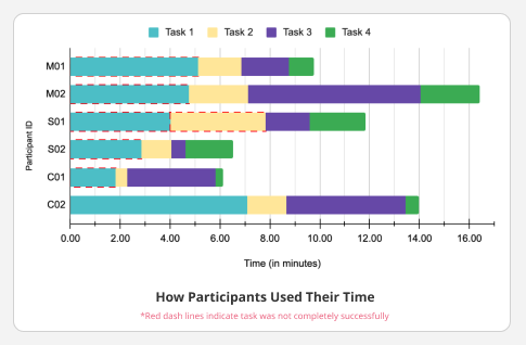
During the sessions, we recorded participants’ screens to observe their actions and asked them to think aloud so that we can hear their thoughts and understand their motives. We carefully reviewed and noted session recordings to help us mark the important comments as well as further observe participants’ behavior. One interesting discovery was that one of my participants tried extra hard to complete the tasks because she likes the aesthetics of the website.
After completing 6 moderated remote user testings, our team analyzed qualitative data with the affinity diagram to share our findings and synthesize our insights. We discovered some emerging patterns and overlap problems, then grouped them together and voted on the main problems based on severity levels. We also reviewed quantitative data by task and uncovered usability issues in the area of locating crucial information and finding specific products.
* Users made positive comments about the aesthetic of the site;
* Users appreciated the consistency between the brand and the products;
* Users were genuinely interested in the company and were excited about the products.

* Users needed more information about the company & the products;
* Users had difficulty locating crucial information due to elements’ low discoverability;
* Users could not find products quickly because of unclear navigation and lack of classification.

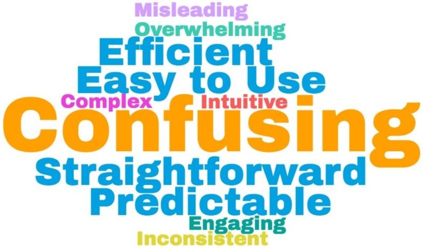
As part of the post-test questions, we asked our participants to select 3 words to describe their experience while using the Strykk website, and the image here shows the most frequently selected descriptive words →
As a Result
* 66.7% of users described the website as confusing, overwhelming, complex and misleading;
* 33.33% of users described the website as straightforward, easy to use, engaging and efficient;
* 33.33% of users described the website as predictable and intuitive.
Currently, there is no clear way for users to find background information on the company or type of products they offered because the website does not have an About or FAQ page on its main top navigation. As a result, 80% of users did not successfully find background information relating to the company or product benefits.
-- “I expected to see an ‘About Us’ section that tells me about the company and possible ways to enjoy their products.” — Participant S2

We recommend moving the FAQ page to the main top-navigation bar and renaming it ‘About’. By doing so, the novice users would be able to learn more about the company upon landing on STRYKK.com, without having to scroll down to the bottom of the page where the current FAQ section is located. Additionally, We recommend making the ‘About Strykk’ and ‘FAQ’ heading texts thicker and the font sizes larger, this will increase discoverability and ensure a clear visual hierarchy.

From the user tests, we learned that free delivery information is not easily perceived. STRYKK’s website offers free delivery on orders of two or more spirit bottles, which is a great deal that can encourage users to increase their order value and promote conversion. However, 67% of users took over 90 seconds to notice any free delivery information, although it was featured both on the banner and product description.
- “I just saw that information on the grey announcement bar, that could’ve been a brighter color to emphasize this deal, because I didn’t even realize it was there.” — Participant S1

Based on participants’ feedback, we decided to place more emphasis on the free delivery information offered on the site, and we recommend changing the current banner background color from grey to a bright gradient to draw more attention to this information. Introducing a bright color will increase discoverability and help users locate this information more easily. We also recommend editing the delivery information in the product descriptions to depict that there are 3 mutually exclusive options to help customers make informed purchasing decisions.

We noticed that product types are not logically organized on Shop All page. The team created a task for participants to find specific products as STRYKK has several different types of products, we wanted to see if they understood the differences between product types. Although most users were able to locate the correct products eventually, it was not a straightforward experience as there is currently no filter system on the shop page, and the products were not categorized in any obvious way. Thus, users expressed their desire to see products grouped in a logical manner.
-- “It doesn’t seem to make sense why the triples are in different places on the page. Why aren’t those next to each other?” — Participant M1

Based on the users’ feedback, we recommend grouping products by type on the Shop All page to help users understand their differences and locate them more efficiently. An alternative solution discussed was related to implementing a filtering system in the shop section to allow users to make active selections, however, we opted out; according to usability expert Steve Krug, when addressing problems, experts should do the least amount of change that could lead to the most impact. In this case, as the product line is not too extensive, a well-organized grouping system on the page would be equally as effective in creating a distinct structure while being more technically feasible.

Our team presented our findings and recommendations to the Digital Lead at Strykk, she was impressed with our work and thought our recommendations were great and easily executable.Our client was particularly interested in the word cloud we created and wondered what caused the dichotomy as some users found the website to be confusing while others thought it was easy to use. I explained to her because our participants liked the aesthetics of the site, therefore even though they might not have successfully completed certain tasks, it didn’t affect the overall experience and they still used positive words to describe the site.Furthermore, our client was shocked that it took more than 90 seconds for the participants to notice the free delivery option, and thought our suggestion of making the banner a bright color could be easily implemented. She also suggested a pop-up on the site to further emphasize the free delivery offer. In the end, the client commented that discoverability is very important for users to perceive information.
This project was both a challenging and a rewarding experience as it was my first time conducting moderated user testings and working in a UX research team to assess usability problems. The recruitment process made me realize the importance of user representations; the user tests taught me how to observe user behavior without introducing bias, and the result analysis helped me become a better teammate. I enjoyed working with my two teammates, Steph and Jungmin, they made this experience easy and smooth!Based on my observations and findings, I realized that many of the problems we identified for the Strykk website were revolved around discoverability issues, whether it’s the unnoticeable free delivery information or the difficulty locating certain products, were mostly caused by items’ low discoverability or unclear visual representations. Therefore, I now fully understand why Don Norman included discoverability with understandability as two main measurements of a good design.
%20(1).png)