
According to the Founder of SI Hunger Task Force, there are two main types of users on the site: 1) people who are looking for pantries; 2) organizations that are trying to donate food to help people in need. She also mentioned that the current site has two major methods for users to find suitable pantries: 1) through the pantry list; 2) through the Google maps. Additionally, they also implemented Google Calendar on the site to further help users locate pantries.
• How are mobile users looking for pantries on the current website?
• How are mobile users interacting with the 3 methods available on the site?
• What actions do mobile users take once they find a suitable pantry?
• What information do most users look at on the top most visited pages?

Google Analytics
Time Frame: 01/01/2022 - 09/27/2022
We used Google Analytics to monitor user behaviors and understand their pain points while navigating the sites. We reviewed behavior flow maps to observe user’s navigation flow, and we evaluated site content statistics to inspect metrics such as bouncing rate and page views.
HotJar
Time Frame: 09/18/2022 - 10/15/2022
We also used HotJar heat maps to further observe user behaviors. The scroll maps gave us a clear idea of how far users scroll down on a page, the heat maps provided information on users’ click patterns, and the screen recordings showed us how they interact with the site content.
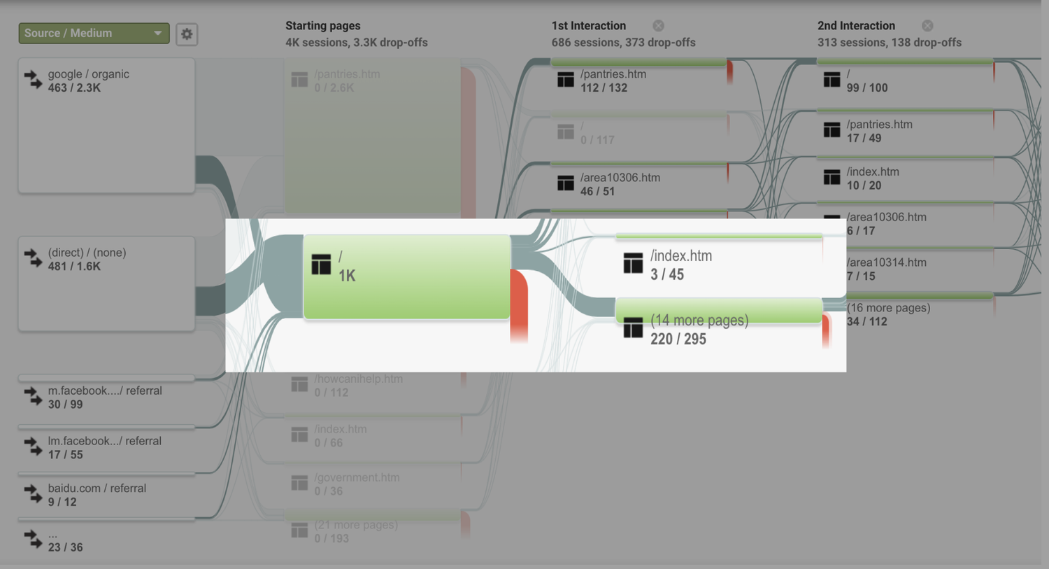
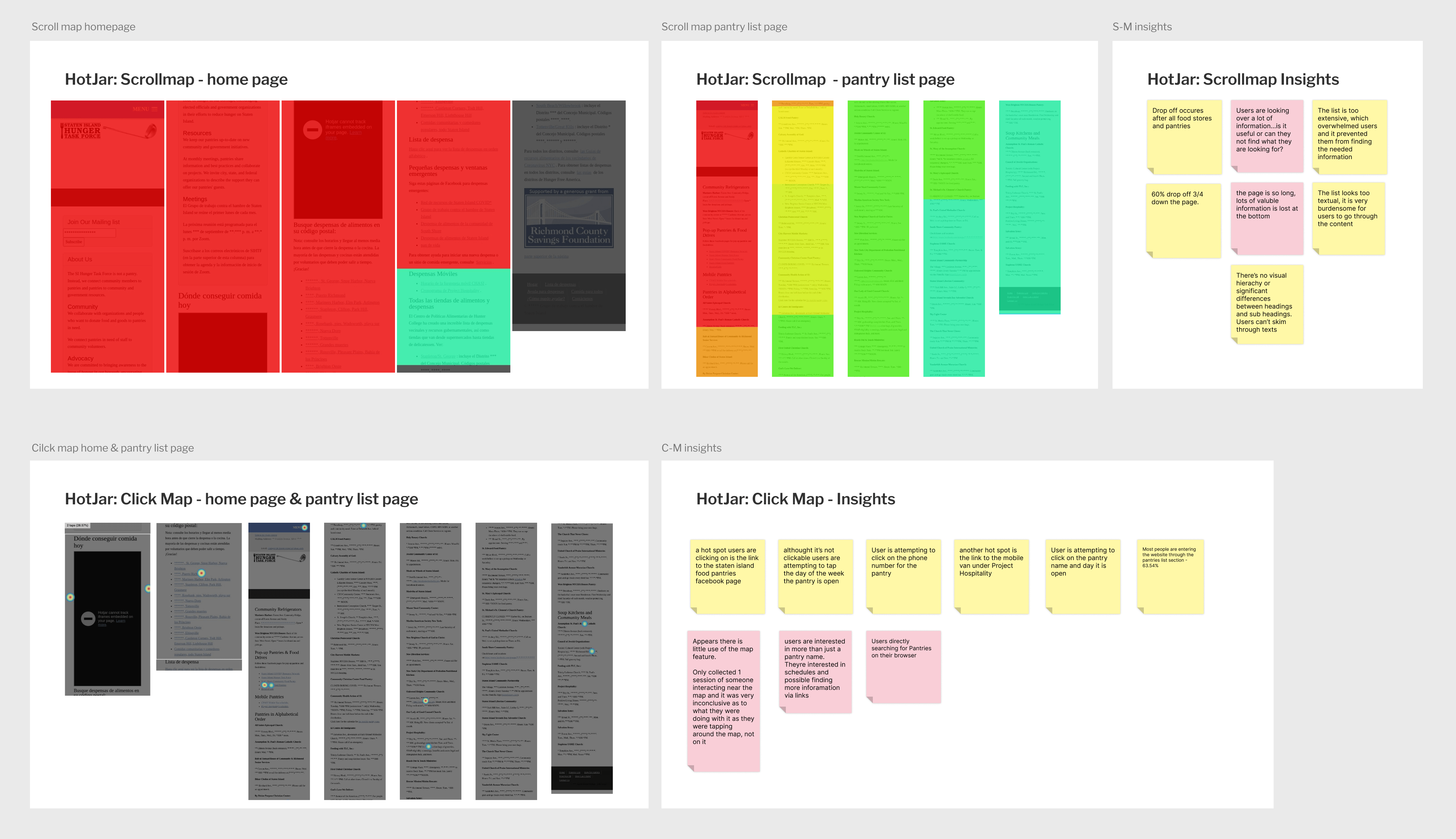
We received 12 user recordings through HotJar, which alone is a very limited amount of data for us to draw a sound conclusion. However, we noticed some similar behavior patterns. For example, we noticed users were caught in a loop trying to find the home page and some kept going back and force between the home page and pantry list page. Based on the data we gathered from HotJar, our team made our initial assumptions. We then reviewed Google Analytic data to confirm our hypothesis, here are the key insights we gained during this process:

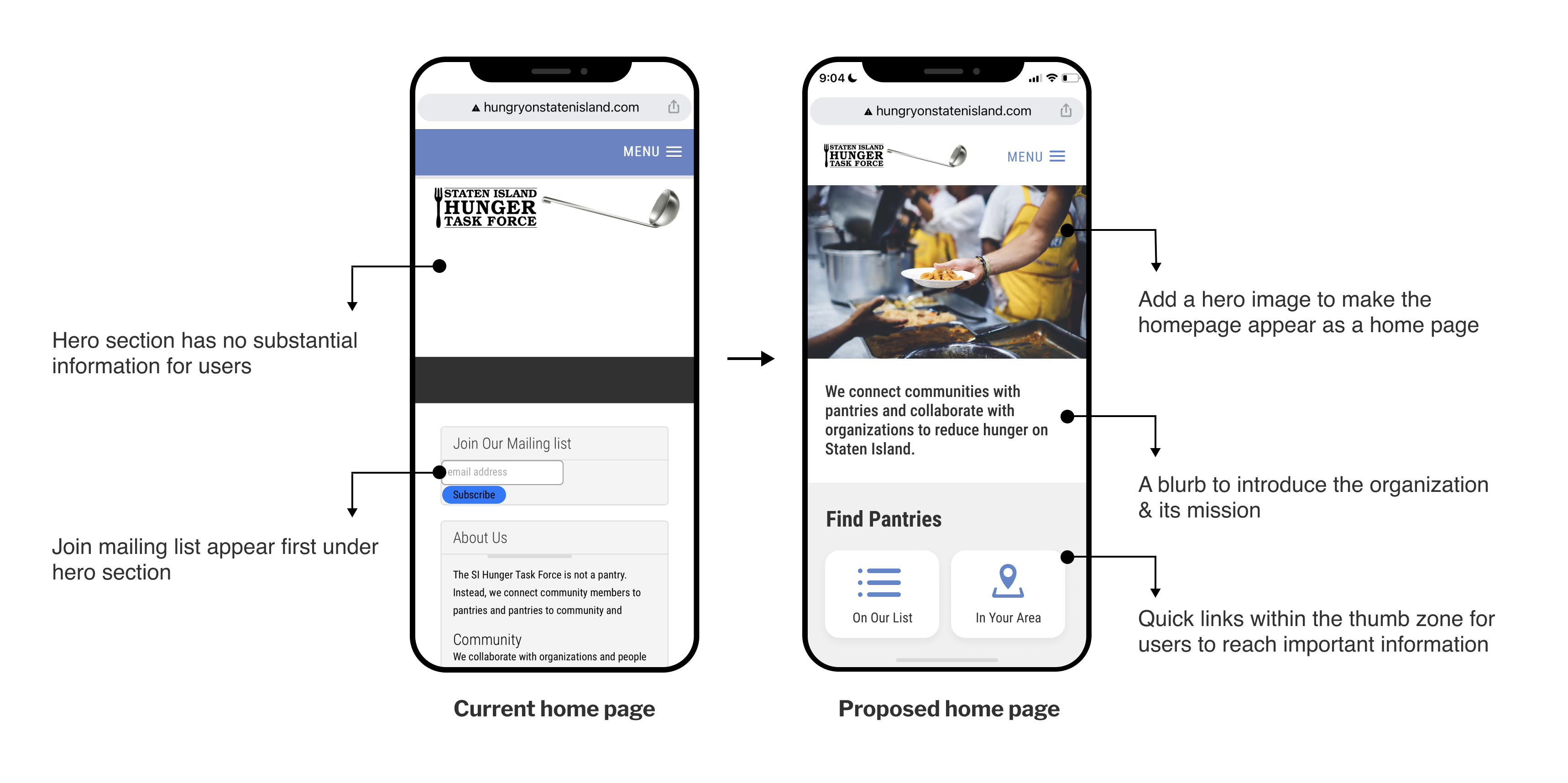
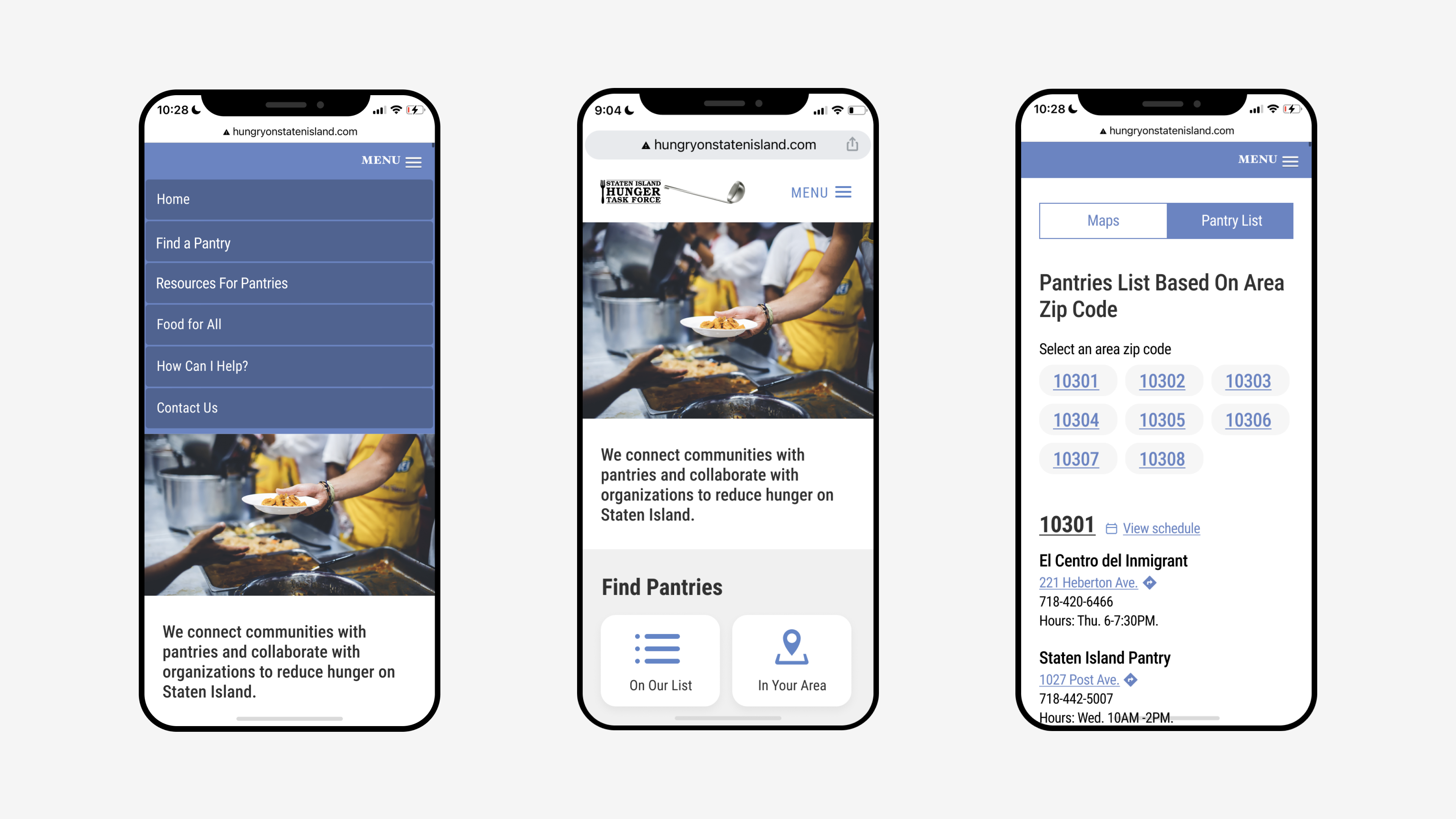
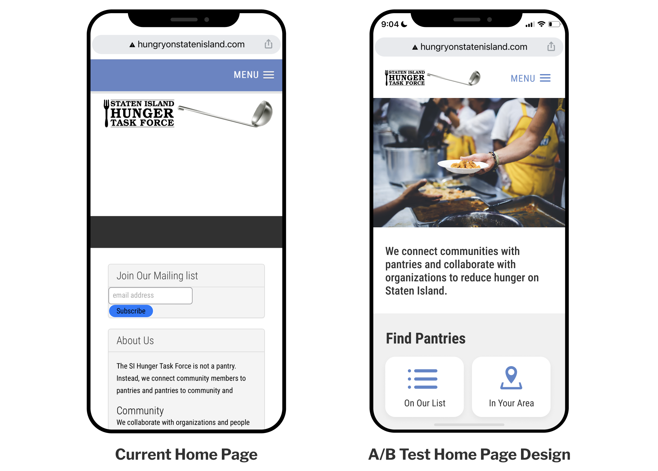
Users would land on the home page, not realizing it is the home page and attempting to click on the hamburger menu and click home again, which takes them to the index.html page.
Additionally, the current hero section does not contain useful information. Further more, the join mail list section appears first under hero section, which usually locates on the bottom of the page just above the footer.
By adding a hero image with relevant visual content, we believe will help users recognize the landing page as a home page. We also added a short description under the hero image to introduce the organization and its mission to get users familiarized with the project. Lastly, we decided to put the quick links of pantry resources within the thumb zone to help users find pantries more efficiently.
The behavior flow map shows that users were going back and forth among Home page, Pantry List page and Area Code pages. This indicates the users’ confusion on locating pantry resources. Additionally, screen recordings from HotJar show users navigate three pages to find relevant pantry information.
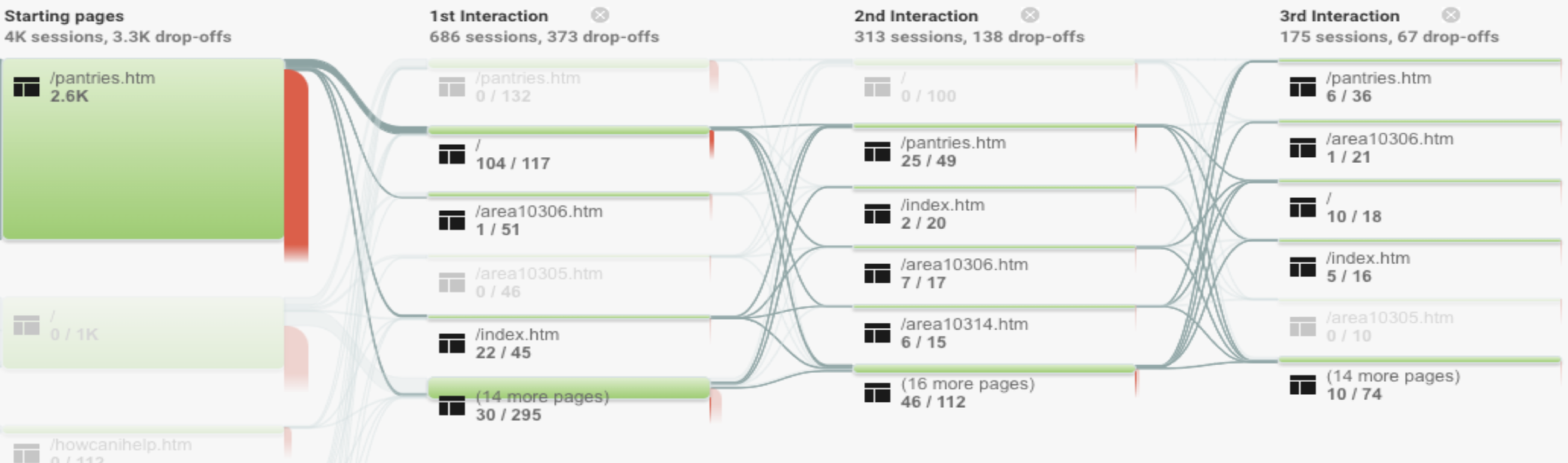
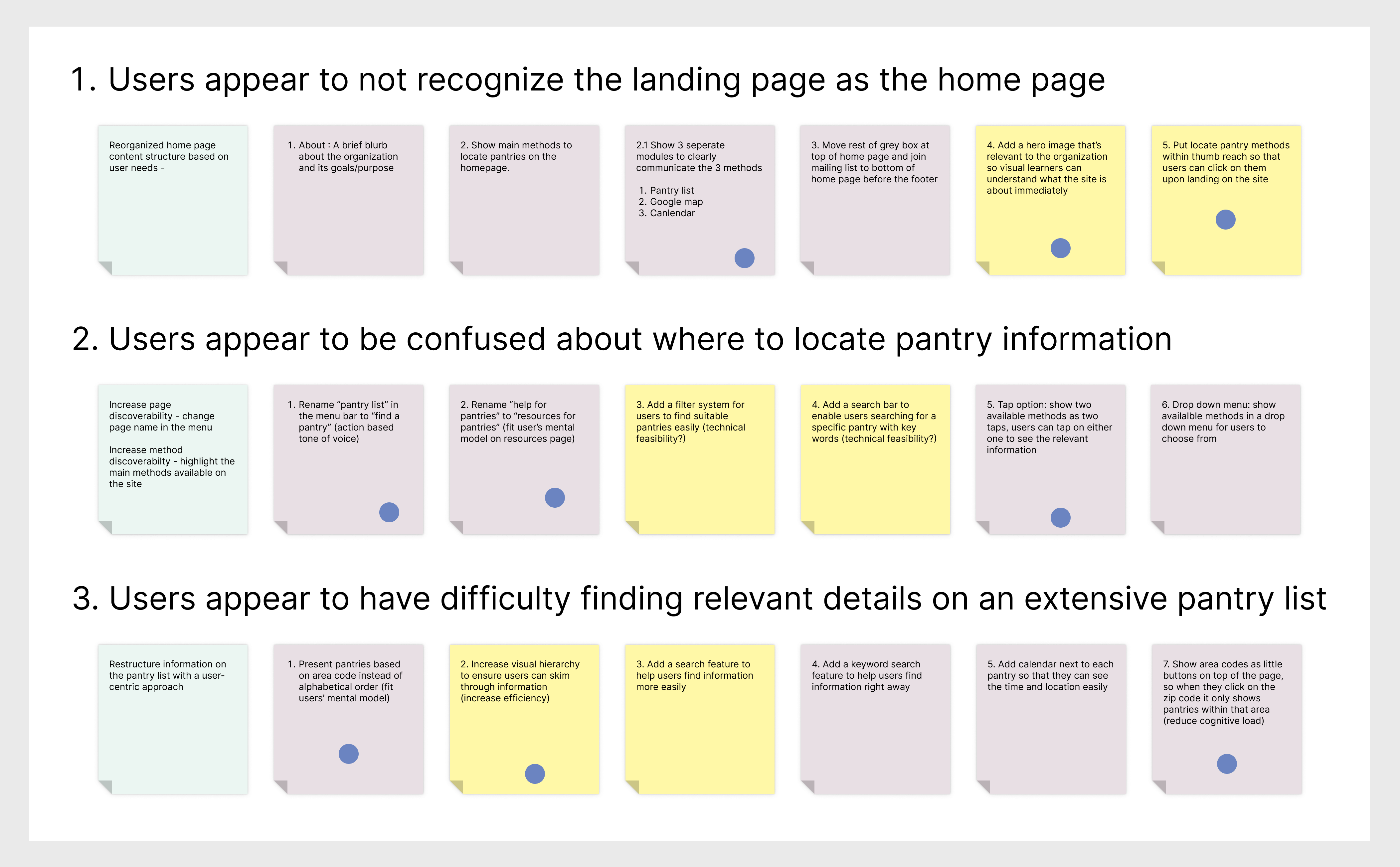
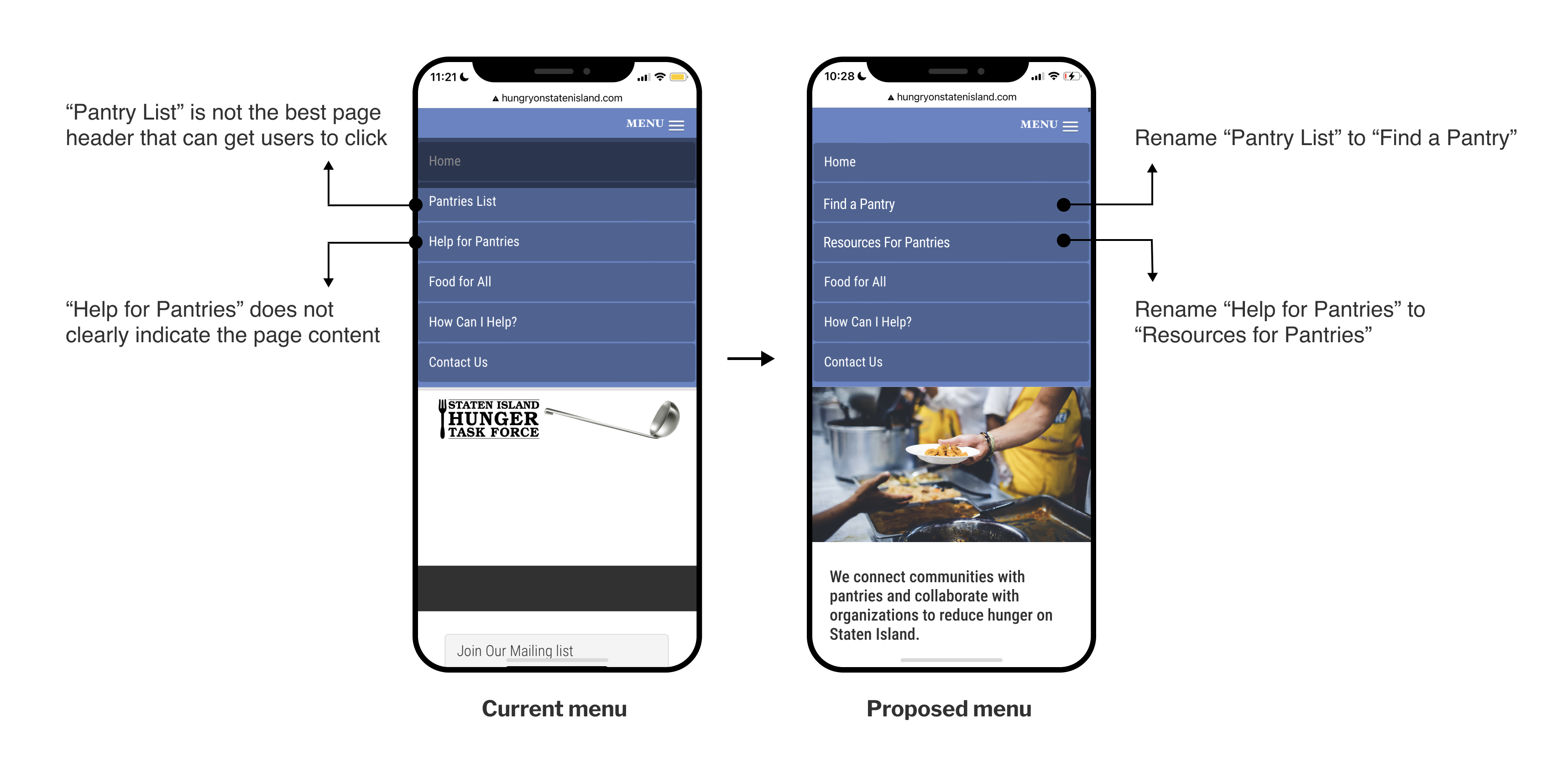
We recommend to rename “Pantry List” to “Find a Pantry”, and rename “Help for Pantries” to “Resources for Pantries”. With a more active tone of voice, we hope users can understand the purpose of each page and achieve their goals while they are on the site.
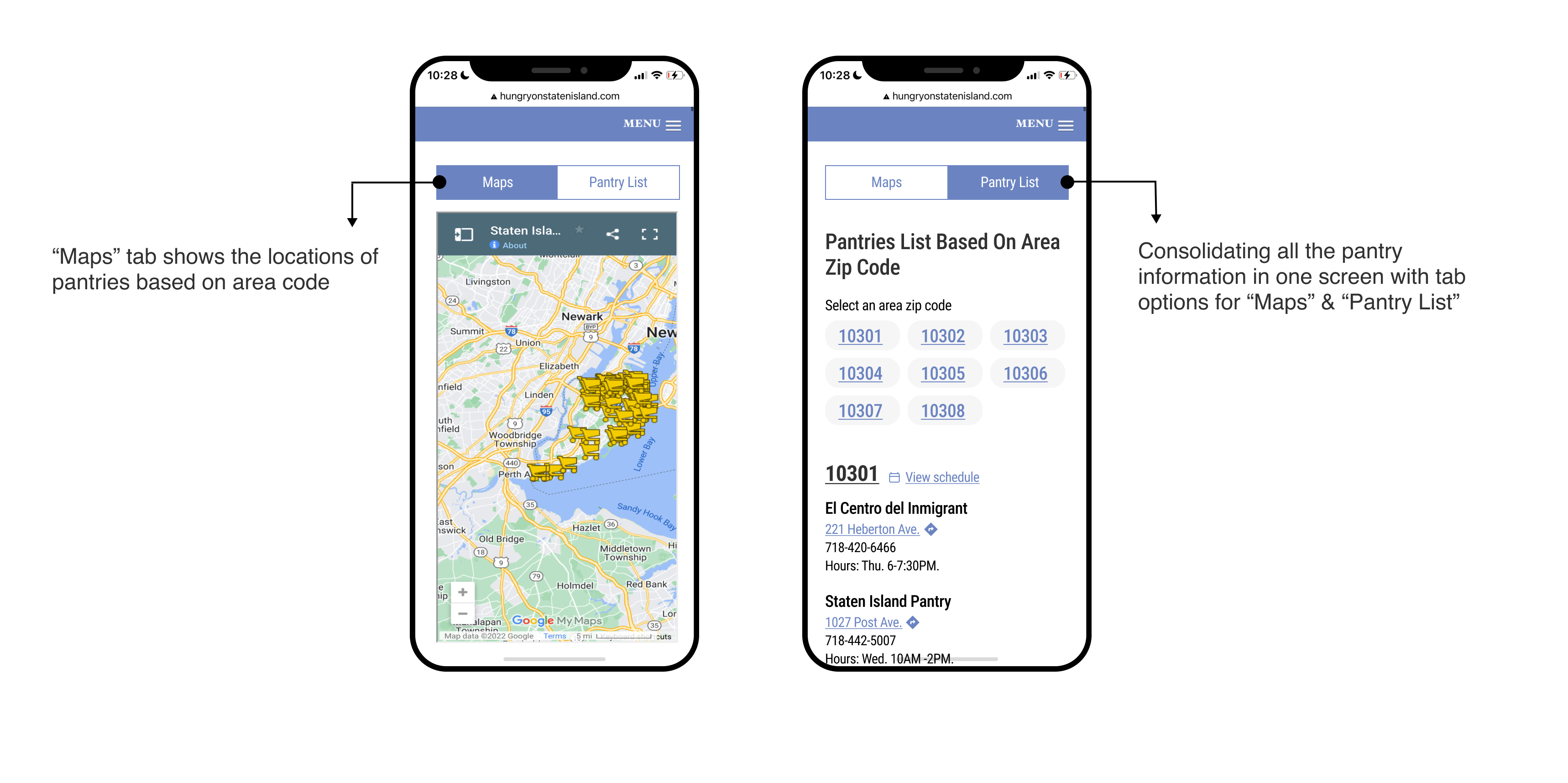
Additionally, we recommend to increase the discoverability of two main methods for finding pantries on the “Find a Pantry” page. We think it is best to put both resources under the same page header but present them with tab options. This way, users will click into the “Find a Pantry” page, and see all the available options at once, this will hopefully reduce the back and forth repetitive clicking behavior.
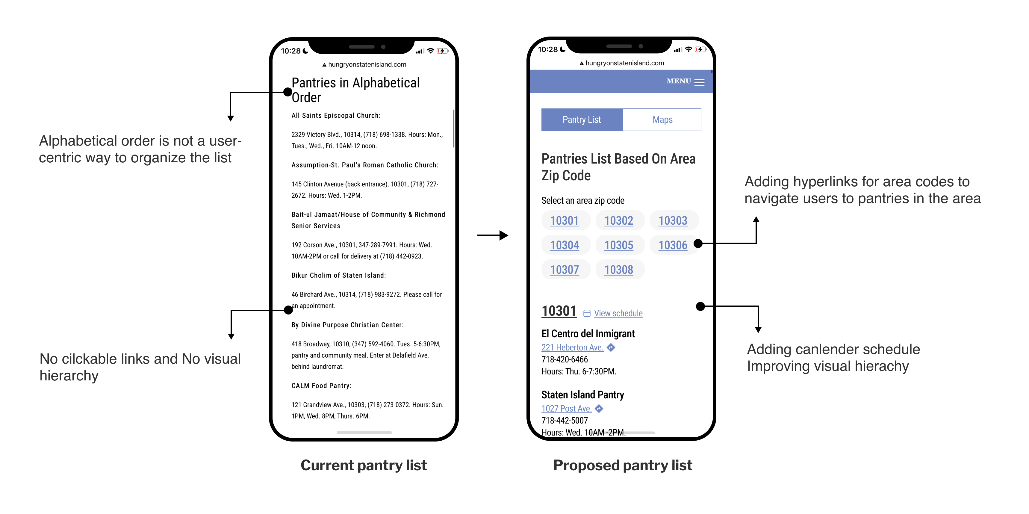
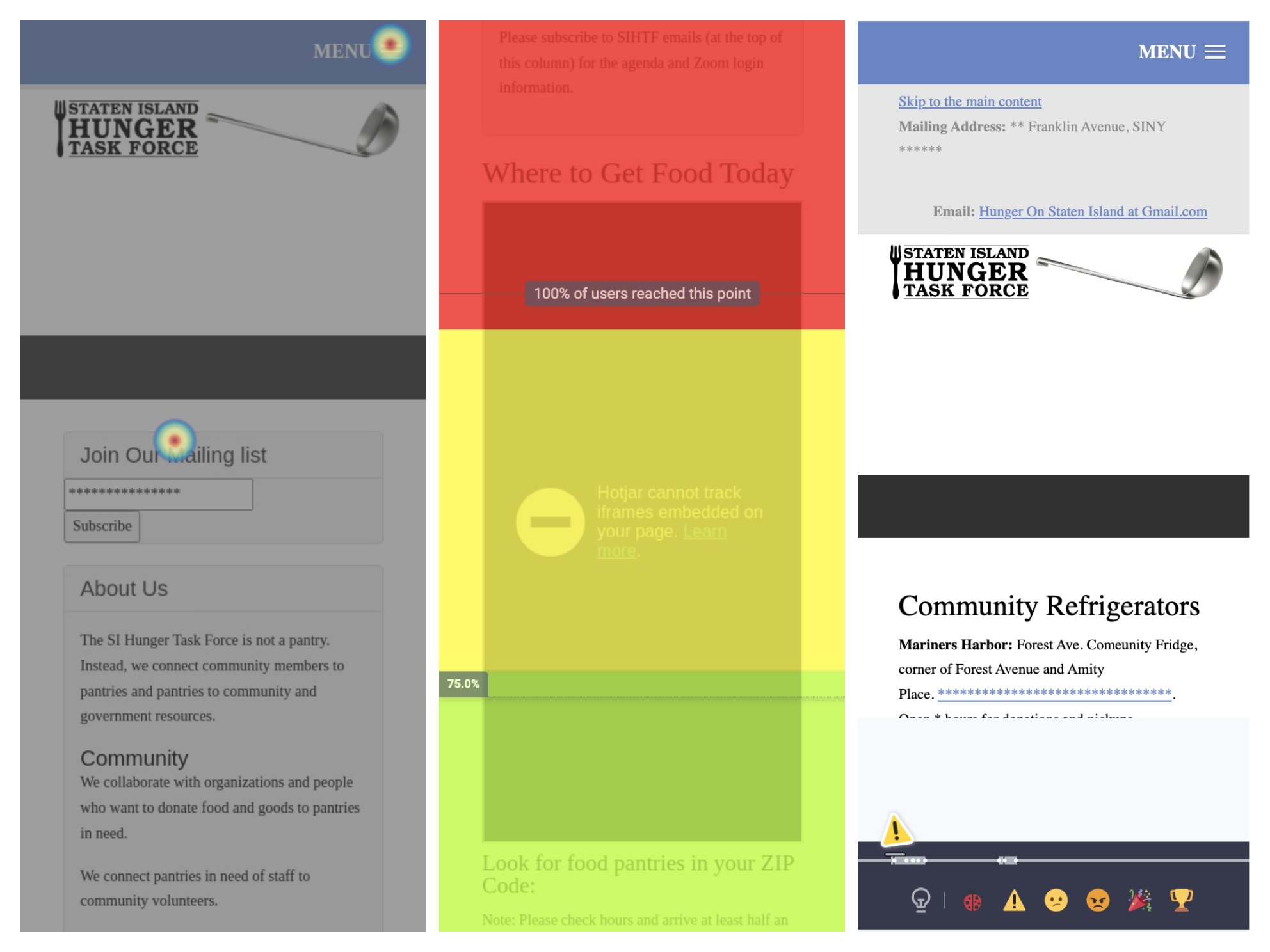
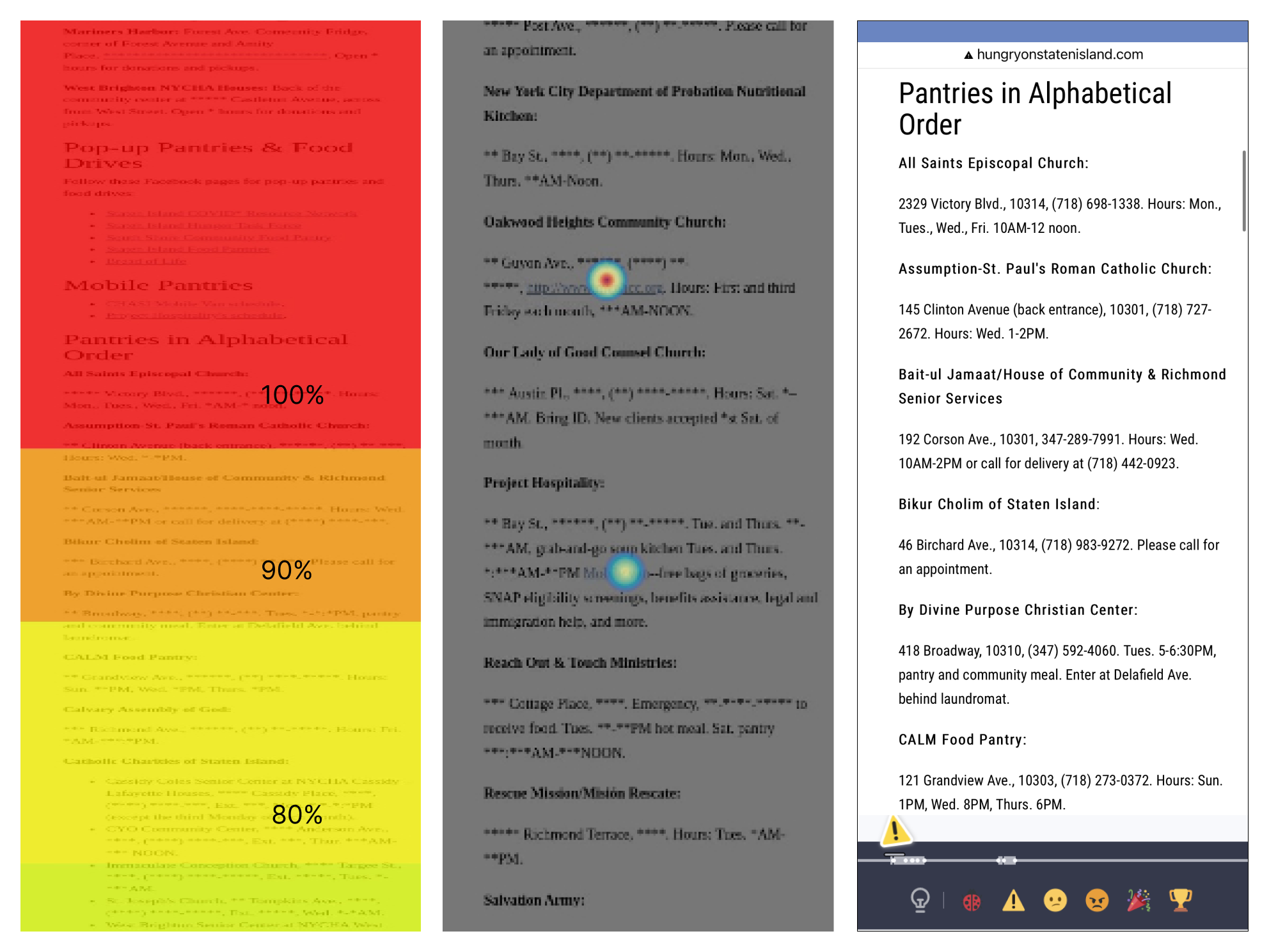
The heat maps indicate that there is a 60% drop off at 3/4 down the page. Which means, lots of valuable information is lost at the bottom. The click maps show that many users attempted to interact with the information provided for each pantry in the list.
We recommend to rearrange the information on the pantry list based on users’ mental model. Therefore, we propose to list pantries based on area code. Additionally, we recommend adding hyperlinks for area codes that can take users directly to a list of pantries within the area.
In order to validate our hypothesis on potential user behaviors on the recommended redesign, we proposed an A/B Test for the Home Page.
Goal: Quickly orient users to the organization’s mission and provides clarity on where to find pantry resources.
Hypothesis: Prioritizing the information on the home page above the fold will reduce confusion and help users locate pantry resources quickly.
Metrics: Reduction in behavior flow interaction":
a. from “/” to “.index.html
b. users bouncing between multiple pantry finding resources
Our team presented our findings and recommendations to the Founder at Staten Island Hunger Task Force, she found with our research useful and thought our findings were very interesting. In the beginning of the presentation when I said users appear to not recognize the landing page as the home page, she was very confused and found it hard to believe. After we finished the presentation, she was actually agreeing on our findings and said it made a lot of sense, and she indicated that the join mail list section should be dropped to the bottom of the page. In the end, she expressed interest in proceeding with our A/B Test proposal and asked if she could have access to HotJar recordings after this project.