
Pratt Institute was founded in 1887 with programs primarily in architecture, design and fine art. Pratt has been ranked one of the World’s Top 10 Art & Design Colleges with 61,000 alumni advancing the creative economy and making a positive impact through their remarkable work and research. About Pratt
Our team met with Pratt Digital Communications team at a client kickoff meeting to address the organization's goals and expectations. From our conversation we learned that they would mainly like to understand:
• How are the current site performing for students to apply for the programs?
• Is it necessary to standardize the information presented across all programs?
.png)
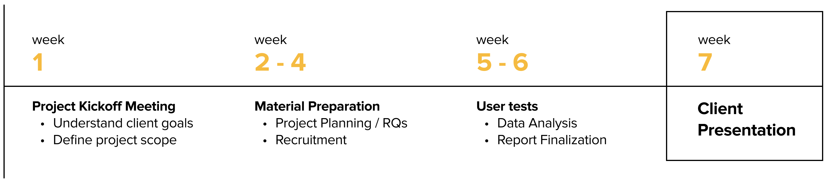
As our clients wanted to know how users interact with the site features, this seemed to be a project that is best fitted for an eye tracking study. An eye tracking study generally includes similar stages to other types of user testing methods, such as test design, recruitment, testing itself, data analysis and proving recommendations through those findings.
Eye tracking is a sensor technology that can detect a person's presence and follow what they are look at in real-time through fixation and saccades. The technology decodes eye movements and translate them into insights that can be used in a wide range of of studies.
Saccade is the rapid eye movement between fixations to move the eye-gaze from one point to another. Fixation is the point between two, during which the eyes are relatively stationaryvirtually all visual input occurs.
With Tobii eye tracking machine that detects users' saccades and fixations, we are able to collect quantitative and qualitative data with the help of following methods:
Retrospective Think Aloud (RTA)
Quantitative questionnaire data
Gaze plots, Gaze replays, Heatmaps
In order to design a good test that can identify potential usability issues, we first need to come up with the right tasks. Since we are all grad students, we naturally recalled what information was important for us when we applied for grad school two years ago. Additionally, I work as the graduate assistant at Pratt School of Information admission's office, hence I was able to refer to the inquiry emails the prospective students sent everyday, and use their inquiries as a guideline for us to craft the tasks.
We noticed there are two main things prospective students ask for during the application process: 1. how do they get accepted; 2. how do they graduate.
Based on those insights, we developed the following 4 tasks to collect information between the 8 tests:
Scenario: You are interested in attending graduate school and are exploring a couple of programs on Pratt Institute's websites to become familiar with the application process and figure out which program fits your interests.
Tasks:
1. Find the required courses you need to take in your first semester within the Communication Design MFA;
2. Find out if you need to submit a portfolio when applying to the Communication Design MFA program;
3. Find out how much that program costs for you to complete the program;
4. Explore another graduate program that you are interested in, and get start on your application.
We recruited 8 participants that fit into the user profile:
- Gender: 5 male and 3 female
- Age: 7 aged between 24- 30, 1 aged within 18 -23
- Status: 6 domestic and 2 international participants

Eight eye tracking sessions can generate a lot of data. To make data analysis more efficient, I created an infinity map template where I asked my teammate to note down the important user quotes, time stamp, task success rate and complete time. The benefit of this method is that if we want to refer back and use certain quotes for the reels, we will be able to track down the exact time with the exact recording. This allowed our research team to quickly access data whenever needed.

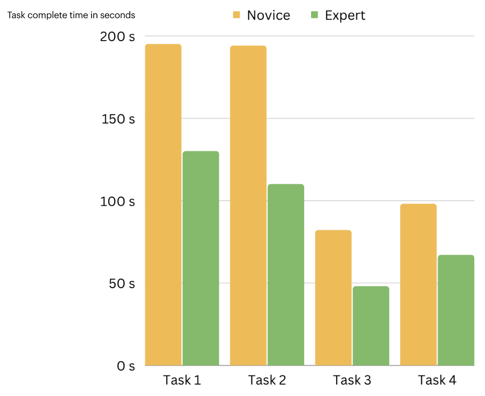
We categorized our participants into two types, the Novice and the Expert.
Novice participants are not actively applying for grad school but would consider in the future.
Expert participants are actively applying and familiar with other school’s admission’s websites.
We noticed the Experts finish the tasks a lot faster than the Novices. We figured it’s because they’ve gone through many admission’s websites, they know what they are looking for and are very familiar with the terms and structures of the site, that’s why they can locate answers efficiently.
After our 8 sessions, We rewatched our RTA recordings and learned that 8 out 8 participants mentioned that they liked the visual aesthetics of the website, they think it looks modern and minimal.
Additionally, as a team we decided a task is marked success when the participant is able to find the answer within 3 minutes. Based on that metric, we calculated the task success rate is 85%, which implies that most of them were able to find answers we asked them to look for in a timely manner.
And our mean SUS score was 77.5, which further proved that users had a positive experience with Pratt’s desktop website.

System Usability Scale (SUS): is a series of 10 Likert-scale questions giving a global view of subjective assessments of usability. A SUS Score that is above 68 would be considered above average. Measuring Usability With SUS
We were also able to identify some areas of improvements, and they mainly fell under the umbrellas of element discoverability and misleading call to actions.

During the tests, most of our participants did not notice there are grad and undergrad taps on the top of the program's page. They were stuck on the undergrad program's page and couldn't find what they were looking for, so they scrolled back up and finally realized there was a graduate tap that presents different information.


Increasing the font size for the 2 tabs and adding an underline under the selected tab would help users discover the two tabs and therefore click on the one that applies to their goal. This way we not only saved users' time but also enhanced elements' discoverability.
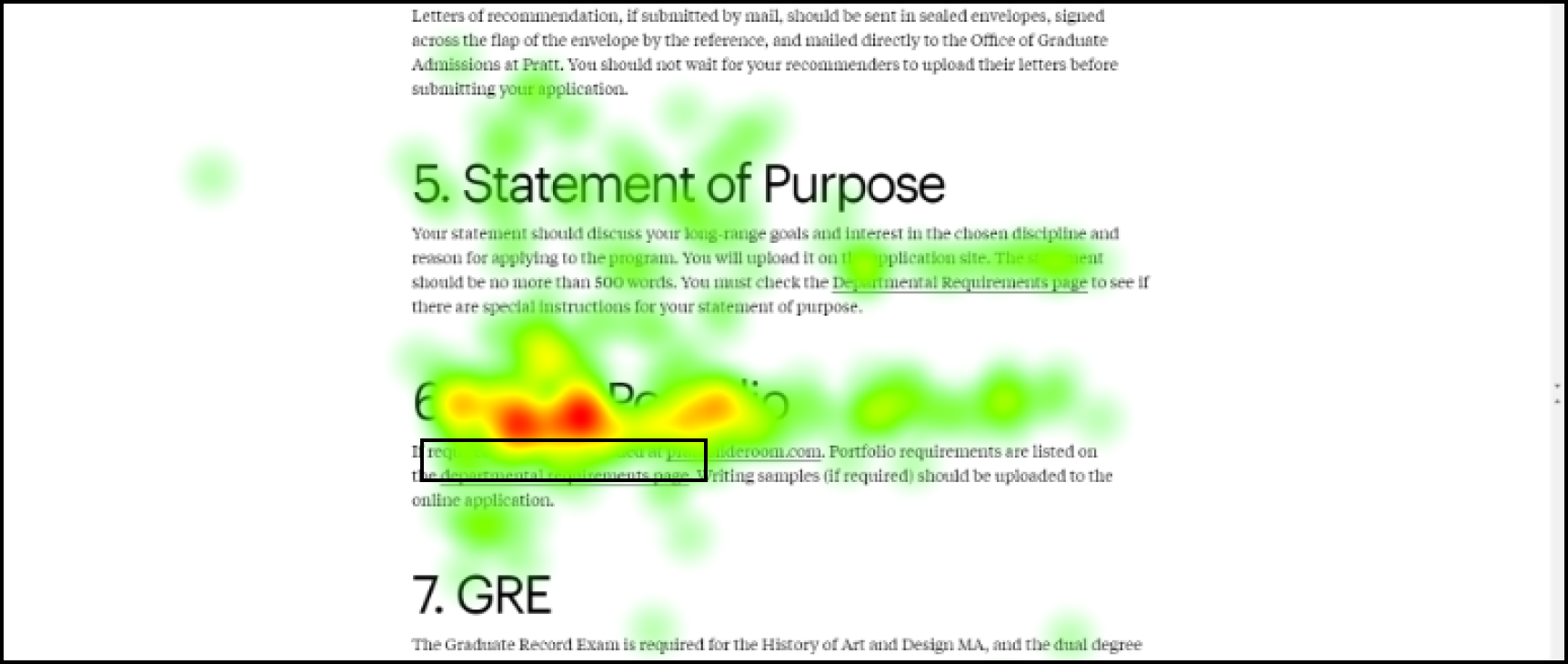

While going through all the gaze recordings, we noticed that 63% our participants had difficultly locating portfolio requirements and 38% continued their search after fixating on the visual portfolio headline. They often navigated to program department page before exploring the graduate admission page, and eventually finding department requirements. Some users found the visual portfolio sections but didn't feel they found the correct information and continued their search.

As participant mentioned, even though the links are underlined, it is still hard to see within the paragraphs. Therefore we decided to highlight them in color so that users will be able to notice them more easily. I decided to assign the links with this blue color as it is the most commonly used link color in many websites we see. It fits users' mental model, so they'd know that's a clickable link.
After rewatching our RTA recordings, we noted 5 participants saying that they expected to start their application when clicking Apply to Pratt.
In reality, once they click on Apply to Pratt, they were then taken to a series of other admission related pages and ended up stuck in a loop.


The problem with the current application flow is that it takes too many steps. Users would have to click on Apply to Pratt, then How to Apply and finally Apply Online to eventually arrive on the application menu page. Because there are too many "Apply" in all of the pages, and each page has a lot of content that can distract them from their application flow, it is easy for users to get lost in the process.
Therefore, we recommend to simplify the application process by eliminating the repetitive clicks. My idea is that once users arrive on a specific program page, there should be a Submit Your Application CTA that directs them to start their application immediately. This way, users will go straight to the point without potential distractions.
When asked to find application requirement for a specific program 62% participants went to the program’s details page first.
Unable to find the required information, they then went to the graduate admissions page. There should be a sustained effort to find the information under the program page itself.

According to the recordings, participants scrolled to the end of the pages while exploring program pages, which indicates they were interested in learning more about the content of the program.
However they seem to be skimming through walls of text in the overview section
The heat map on the right shows users' gaze pattern.


We recommend to consolidate and organize information based on users’ needs. Therefore, we propose to truncate information and reduce users' cognitive load, this way users will have an easier time read and extract information on the site.
This eye tracking usability study comes with unique challenges. In order to communicate our findings with clients in a more engaging way, it is important that we present our research results with a storytelling mindset, this way hopefully our clients will be able to connect with our process in a deeper level.
Our research findings also need to have truthful and applicable data to back them up. We combined quantitative and qualitative data to make our findings sound. We also used participants' audio clips with quotes to effectively show our clients exactly what they said and how they said it.
Our team remotely presented our findings and recommendations to Pratt Digital Communications team. We discussed high-level findings and provided data that compliment our research results. The Digital Lead Sarah was glad that someone liked this project in terms of the visual aspects. The web developer Alex said our presentation was well-put-together. In the end, they expressed our presentation could really inform further research on their end and eventually implement positive changes to make the site more user friendly and accessible.
