
.png)

Although AFC Cinema has made a web accessibility section dedicated on their website, our review found that the site's information hierarchy and visual language are unclear and inconsistent, making it difficult for users to navigate and locate information.
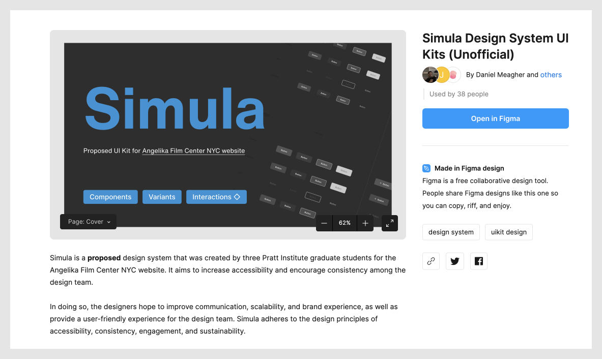
To improve the accessibility and visual consistency of the AFC website, we created Simula, a design system aimed at enhancing user engagement and expanding the site's audience for an enjoyable theater experience.

Defining our design principles before building the system was crucial for guiding our decisions throughout development. Our user-centric approach prioritizes accessibility and consistency while also ensuring an engaging and enjoyable experience for AFC's entertainment-focused user base.
Follows WCAG Guidelines
User-friendly & intuitive
Visual language
Reduce cognitive load
Capture user attention
Immersive & enjoyable
Atomic design
Reusable components
Prior to building the system, we decided against rebranding AFC entirely. Instead, we selected key elements from the existing site as guidelines to kick-start our project. By doing so, we aim to ensure that the site remains recognizable and that loyal customers are not lost during the transition to an improved design.
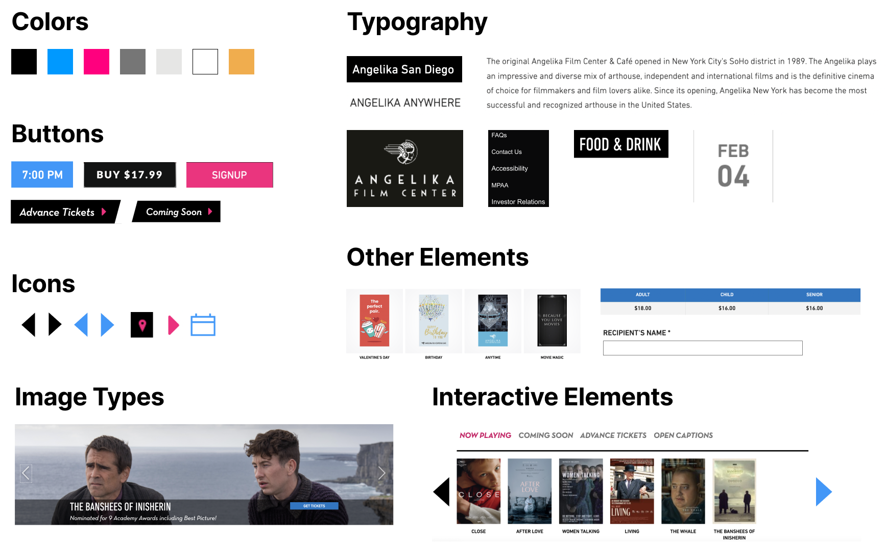
To ensure scalability and adaptability of Simula, our team must align on foundational design elements that guide high-level components, including color, typography, grids, spacing, and interactive elements.
We kept the same blue and pink currently on AFC website as our main accent colors to maintain consistency and familiarity for users.
Hierarchy: We established varying levels of hierarchy in our color palettes to ensure clear visual communication and consistency throughout the system.
States: We introduced success, error, and warning states to our design system to provide proper visual feedback to the users.
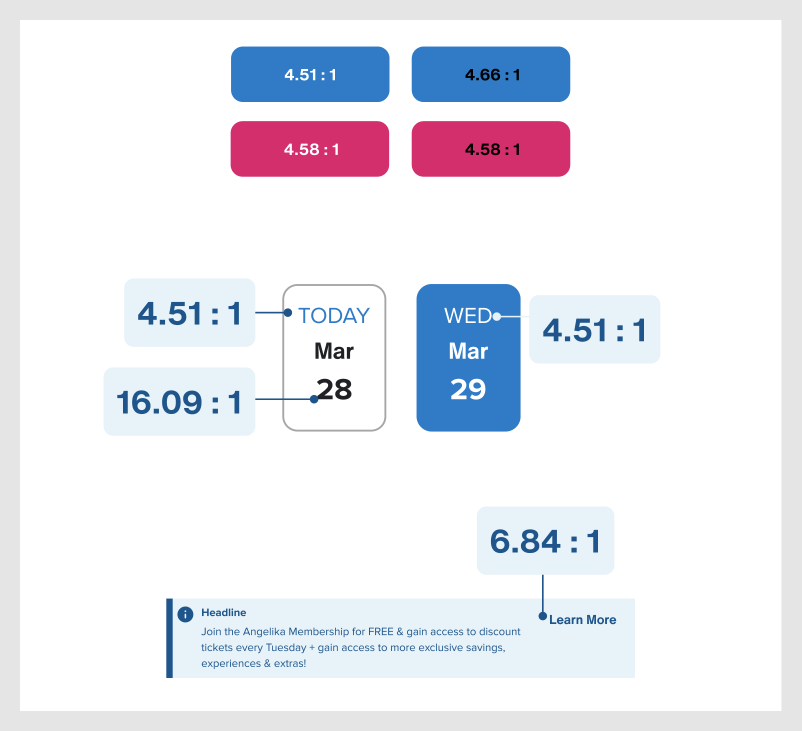
Accessibility: We prioritized color accessibility in the design system by adhering to the minimum contrast requirements outlined in the WCAG 2.1 guidelines.

We defined a grid system for various screen sizes to ensure consistent layout and alignment of elements, improving the overall visual hierarchy.
We also established specific spacing guidelines between elements to improve the visual clarity and consistency.

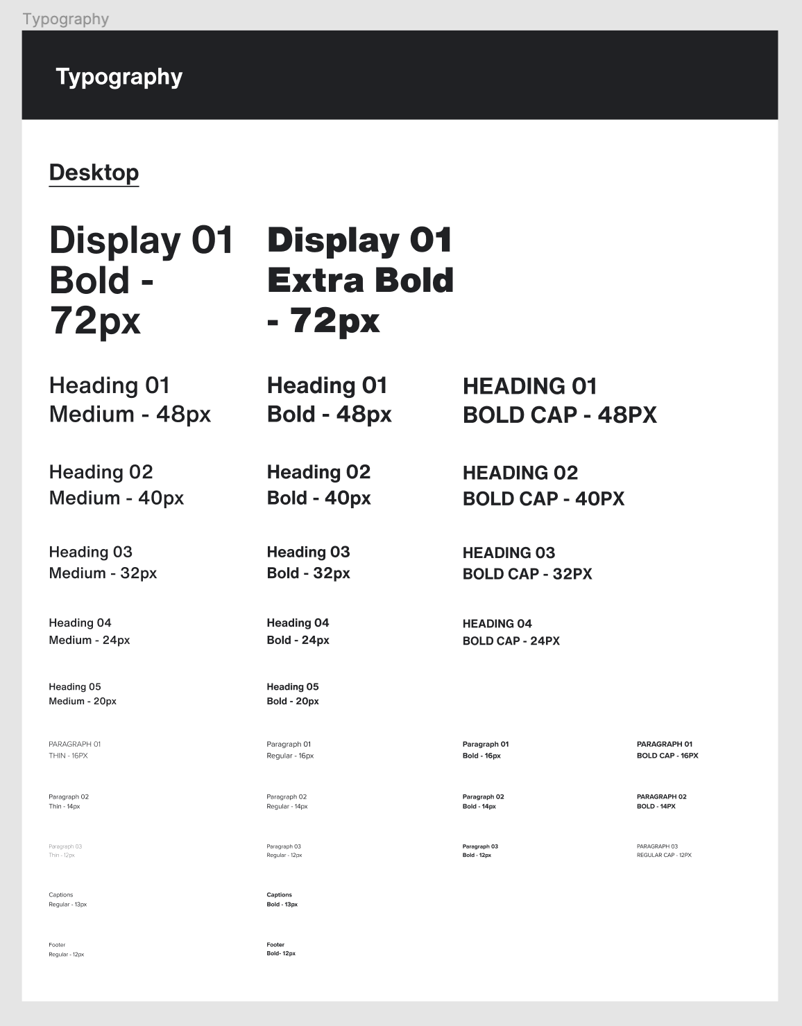
Our design system uses Helvetica Now as the primary typeface, chosen for its legibility and versatility. Proxima Nova is used as the secondary typeface, complementing Helvetica Now with its modern appearance.
To further address accessibility, we use font sizes that are large enough to be legible on various screen sizes and ensure proper contrast between the typography and background.
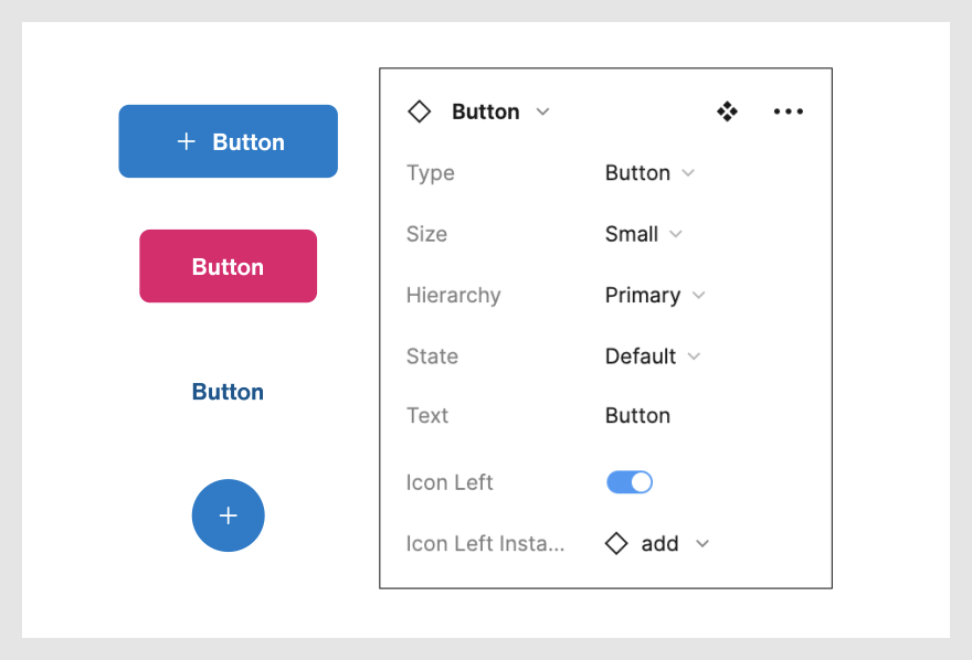
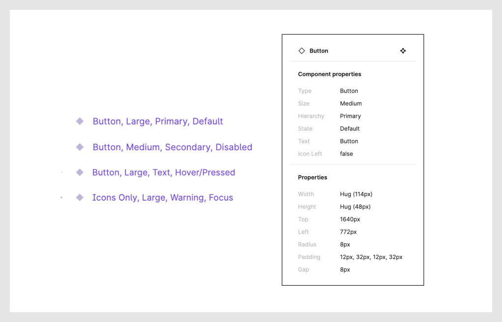
A component library is a collection of reusable interface elements that promotes consistency and efficiency in design and development. We defined different variants and states for each component to simplify the design process and ensure accurate and consistent implementation.
We chose button styles as a starting point due to their frequent use and importance in establishing design consistency.
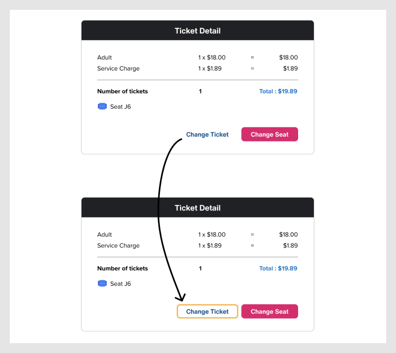
Hierarchy: We introduced hierarchy in our button styles, with primary buttons designed to attract user attention while secondary buttons serve a supporting role in the interface.
Sizes: Our button styles are available in different sizes, allowing them to be used in a variety of contexts and screen sizes.
States: We also incorporated various states to provide users with proper visual feedback. These states include default, hover/pressed, focus, and disabled, each serving a specific purpose based on the users' actions.

Our navigational components have stepped interaction examples to help communicate expected interaction states. This ensures that users can easily understand and engage with the interface.

We developed a range of component templates for frequently-used sections such as the footer, newsletter and image carousels. By implementing these templates, we can maintain consistency across pages and screens, while also significantly speeding up the design process for teams.

We prioritized accessibility in our design system and followed the WCAG guidelines to ensure that our design system is inclusive for users with disabilities.To achieve this goal, we followed the Web Content Accessibility Guidelines (WCAG) developed by the World Wide Web Consortium (W3C).
To ensure inclusivity for users with visual impairments, we adhered to the WCAG 2.1 guidelines, which require a minimum contrast ratio of 4.51 between foreground and background colors.
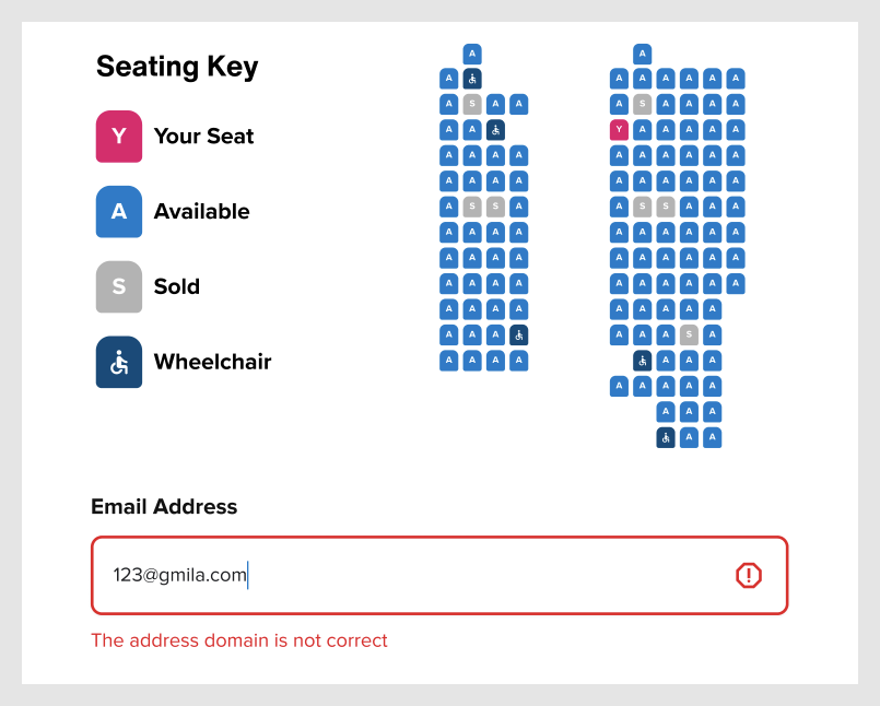
We followed WCAG guidelines to ensure information conveyed through color is also available in other forms, such as text or patterns. For example, we included letters on differently colored seats for users with color blindness, and provided text explanations for error states to aid understanding.
Additionally, we also enabled keyboard navigation for users who may not be able to use a mouse or trackpad. This allows them to navigate through our website using only their keyboard, ensuring that they can fully interact with and access all content and features.
We identified two user groups for Simula: AFC online customers and internal teams responsible for design and development. We also addressed the needs of designers, developers, and other stakeholders who will be using the system.
We created our components with variants, allowing designers to switch between different styles with just a few clicks on the properties panel. This simplifies the process of duplicating design elements and reduces the time required to create new elements.
We implemented an organized labeling system based on the functionality and styles of the components, making it simple and efficient for designers and developers to use and customize them as needed.
Our comprehensive design system comes with clear accessibility standards and guidelines that empower designers to create high-quality designs quickly and encourage teamwork. We also aim to make our design system available to those outside of the organization to assist in their work. To this end, we have created a documentation site and a Figma UI kit to facilitate the adoption of our design system.
The documentation site on Zeroheight encompasses our design principles, accessibility standards, best practices and usages. Additionally, we have a governance policy in place to provide clear guidelines for contributions and support from our users.
With our Figma UI kit provided, we encourage users to understand the components to use them in the right context; and we empower users to customize the elements to fit their design needs and ensure accessibility and consistency with our design system.
Through this project, I gained a deeper understanding of Figma's advanced features such as components and auto layouts. I realized that Figma is an excellent design tool with powerful features that enable teams to work efficiently together.
Moreover, it allowed me to explore how to distribute design responsibilities within a team that has different design habits and varying levels of software proficiency. I learned the importance of clear communication and patience when working with teammates, and it is essential to provide support and resources to help each other learn and grow. I realized that this not only improves the quality of the design work, but it also promotes a more collaborative and supportive work environment.
I also learned that a design system is more than just a UI kit. While the UI kit is an essential component, it's also important to have clear design principles, governance policies, and a focus on consistency and sustainability. This project helped me better understand the importance of a comprehensive design system and how it can benefit not only the design team but the entire organization.